Logo/Logotype – Coach
Coach is a very popular brand for bags and high-end clothing and accessories. Their logo exhibits an established feel. The main aspect of the logo is the horses and carriage which is a very old mode of transportation and thus distinguishes them as an old and established company. The written part of the logo appears hand drawn and this adds to their age. Consumers appreciate established companies that have been around for a while and thus know their stuff. This age makes the brand more prestigious.
I like this logo not only because I like coach products, but because I like the history of the logo. I love old, traditional things and this logo illustrates this. It is a catchy logo because of its simplicity and class.
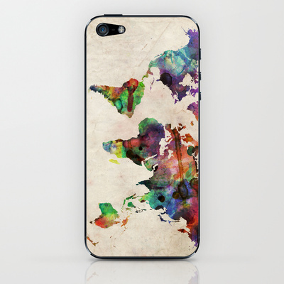
Device Skin – Watercolour World Map
This skin caught my eye for two reasons: I want to travel the world one day and I love vivid colours. A map is a perfect illustration of my desire to travel. I want to experience the various cultures that make up our diverse world by traveling and emerging myself into different cultures. This skin is interesting because I interpret the variety of different colours with the diversity and uniqueness of each country. The world has so much to offer and the colourfulness of this skin portrays the excitement that lies behind this. Bright and vivid colours create excitement because they contrast when together that ironically creates visual appeal.
Animation – To This Day
The video “To This Day” is a video composed of numerous clips from different animators that makes up a story about bullying. My favourite clip from the video was Clip 3 by Adam Plouff. Adam Plouff is an up and coming animator that has recently had success in the industry, being discovered online. I really liked the style of this animation and the consistency of the theme. The interconnectedness of the visuals created flow in the animation. An example of this is when the nose representing Pinocchio turns into a thumb giving the thumbs up. Such clever ideas creates a rhythm in the piece because the current frame relates to the next frame. The words that are being said effectively match the visual that is presented on the screen. This creates an attractive and eye-catching animation. The type of animation he used is 2D animation, but more specifically, clay animation. The images appear to be made of clay and reformed to change frame to frame.
Animation – Cinemagraph
This is a cinemagraph of a scene in New York City. The only aspect of the scene that moves is the yellow taxis passing through the intersection. Yellow taxis are a popular icon of New York City and this gif effectively highlights that aspect by assigning movement to that scene to best represent the city. The movement of the taxis and vivid colour of the taxis next to the dull surroundings attract the viewers eyes. The movement of the taxis not only grasps the viewer’s attention, but encourages the viewer to explore all aspects of the piece. The viewer first observes the classic yellow taxis and then the rest of the motionless aspects of the scene, such as the old buildings, pedestrians, and busy life.
Animation – Gifs
This is a gif of Lana Del Rey singing on stage. The whole scene is moving, similar to a video, but instead, is clips of numerous consecutive photos that make a moving piece. The desaturation throughout the piece creates interest in the gif because during each frame, the piece looses more and more colour until it is black and white at the end. This subtle change during the duration of the gif captures the vintage feel of the piece. This piece has a very vintage feel where all aspects of it have a aged and timeless look. This is included in the dress Lana Del Rey is wearing, the hair style she has and background that stands behind her.


